
Blind spots breed doubt
NS1's customers were managing billions of DNS queries a month with almost no visibility into what they were actually consuming. The existing Usage page offered surface-level metrics at best — no breakdown by network, no projection of where usage was heading, and no clear connection between usage and billing.
For network architects managing budgets that get allocated across business units and charged back to product teams, this lack of clarity wasn't just inconvenient, it was a financial liability. Surprise overages, missed optimization opportunities, and an inability to forecast spend were quietly eroding trust in the platform.
Without a self-service alternative, customers relied on customer success engineers and account managers to manually generate usage reports, creating bottlenecks on both sides of the relationship.
Those who made it happen
Terry Bernstein – Senior Director of Product Management
Ishita Parekh – Product Manager
Didier Blanchard – Engineering Manager
Jessica St. Juste – Product Program Manager
Da Liu – Front-End Lead
Paul Burrows – Back-End Lead
Erin Pelkey – Content Strategist
Tony Hartonias – Product Designer
What was at stake
In a usage-based pricing model, customers need to understand their own consumption to make good decisions. Without that understanding, two things happen: they either overspend without realizing it, or they underutilize capabilities they're already paying for. Both outcomes are bad for the business.
NS1's mid-market and enterprise customers were stuck in that gap. Network architects had no self-service way to see current consumption against contracted limits, forecast where they'd land at the end of a billing cycle, or understand how tiered and overage-based pricing applied to their specific usage patterns. Basic questions such as "Am I going to hit my cap this month?" or "Which network is driving the most query volume?" required reaching out to account managers or digging through separate billing tools.
The cost of this blind spot was tangible. Part of the reason why customers weren't upgrading was because they couldn't see the value of premium features in the context of their own usage. And the lack of proactive overage warnings meant customers were getting surprised by bills, the fastest way to damage a commercial relationship.

My role and responsibilities
I led the design of the Account Usage and Limits experience end-to-end, from early exploration through usability testing and implementation, partnering with product management, engineering, and content teams throughout the process.
Challenges and constraints
Finding the sweet spot
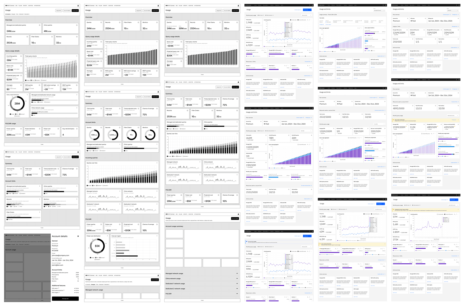
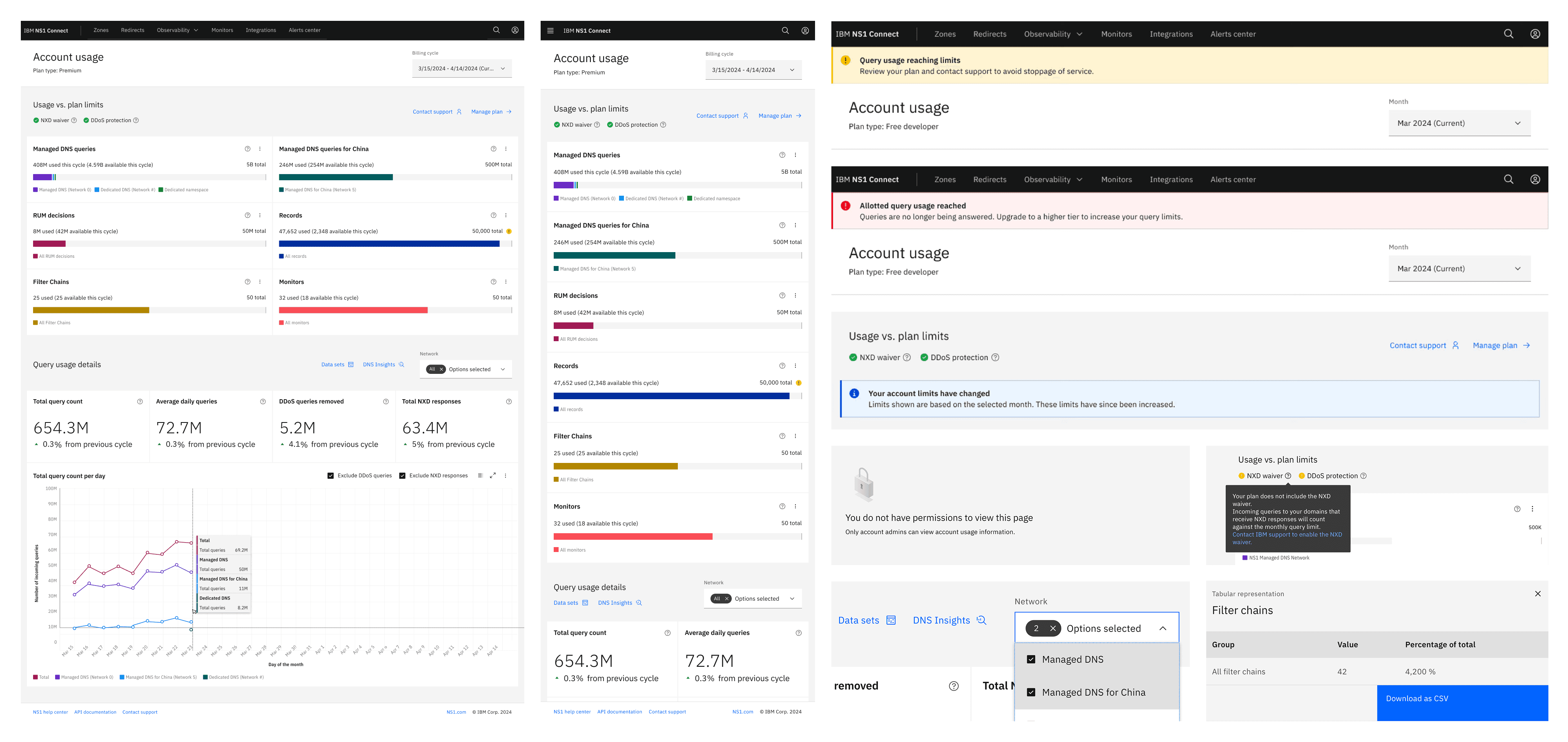
The core challenge was density without overload. Network architects needed granular data but the moment the page felt like a spreadsheet, it would fail. I had to find the right hierarchy of information so that the most actionable insights surfaced immediately, while deeper breakdowns remained accessible without cluttering the primary view.
Layers beneath the obvious
The design also had to account for a wide range of scenarios such as permission gating, contextual differences between upgrade and downgrade states, responsive behavior across devices, and clear alignment between dashboard metrics and contract terms.
New design system
This was the very first experience in the NS1 Connect portal built from the ground up using IBM Carbon v11, which meant a steep learning curve. We needed to familiarize ourselves with the library's patterns and components while testing its limitations in a production context, learning the system and shipping with it at the same time.
The key moves
Designing for anticipation, not just reporting
The biggest shift from the old Usage page wasn't showing more data, it was showing data that helped users look forward. I designed the dashboard using visualizations that helped users quickly get a clear picture of their usage by the end of their billing cycle. This reframed the page from a passive record of what already happened into an active tool for financial planning. Network architects could finally answer "Where am I headed?" without doing the math themselves.
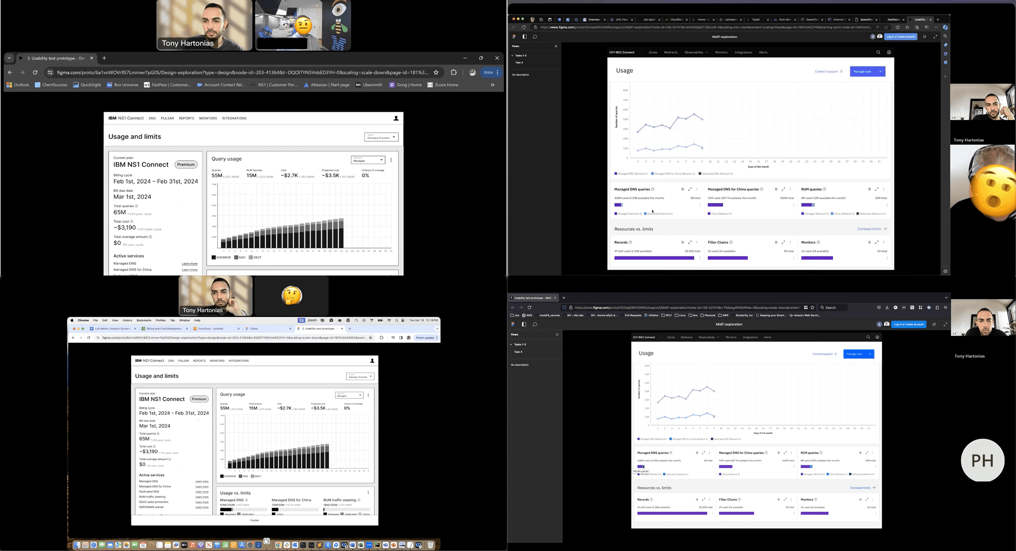
Two rounds of testing with different lenses
I ran two distinct rounds of moderated usability testing to validate the design from both internal and external perspectives.
The first round brought in customer facing teams — customer success, professional services, and sales engineers — to pressure dtest the clarity and usefulness of the information architecture against low-fidelity prototypes. These were the people fielding usage questions daily, so their signal on what mattered most was invaluable.
The second round put high-fidelity prototypes in front of actual NS1 customers for task-based evaluation. All participants completed every assigned task successfully, with an average usability score of 4.75 out of 5. No critical issues surfaced in the second round, confirming that the information hierarchy and interaction patterns were working as intended.
Accounting for every scenario
Usage dashboards break when they only design for the happy path. I mapped out every edge case and conditional state: permissions gating to prevent unauthorized access, contextual help explaining how each chart's data is calculated and how it aligns with contract terms, dynamic adjustments based on tier upgrades or downgrades, proactive overage warnings as users approach plan limits, and responsive layouts that maintained clarity across screen sizes. Documenting these scenarios upfront meant engineering could build with confidence rather than discovering requirements mid-sprint.
The impact
The redesigned Account Usage and Limits page drove measurable results across multiple dimensions. Mid-market e-commerce bookings increased, contributing to NS1 answering over 4.5 trillion queries per month starting November 2025, a 500 million query increase from the previous month. The self-service upgrade pathway supported IBM's product-led growth strategy, resulting in a 25% increase in usage and sales of advanced and premium features.
Beyond the numbers, the dashboard shifted the nature of customer conversations. Account managers and customer success teams were no longer fielding basic consumption questions, freeing them to focus on strategic engagement. Customers had the tools to plan, forecast, and act on their own terms.
What I learned
Building tools that global services depend on has taught me that trust sits at the foundation. Every touchpoint either reinforces it or risks undoing it, and great design reassures people that they're in control and supported as they serve their own customers.
I've also learned how easy it is to let assumptions mislead you. Network admins love data, and it's tempting to pack a dashboard with every available datapoint and call it "transparency." But more data doesn't automatically mean more confidence, it can add noise where someone needed clarity.
What matters more is understanding what actually drives the people using these tools — what makes them feel accomplished, where doubt creeps in. Trust isn't built by showing people everything. It's built by showing them you understand what they need to see.